Suncup ABA: Thrive Through Adversity
Client: Suncup ABA — Market: ABA Therapy
What we did
Logo Design
Brand Identity
Illustrations
Brand Strategy
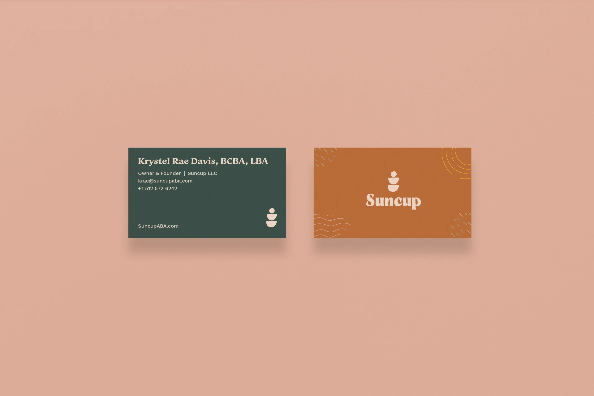
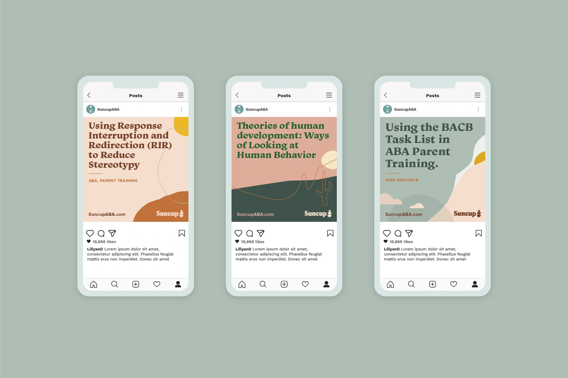
Brand Collateral
Lettering
Copy Writing
Team
Creative Direction: Petre Spassov
Design: Hanna Raymond
Assignment
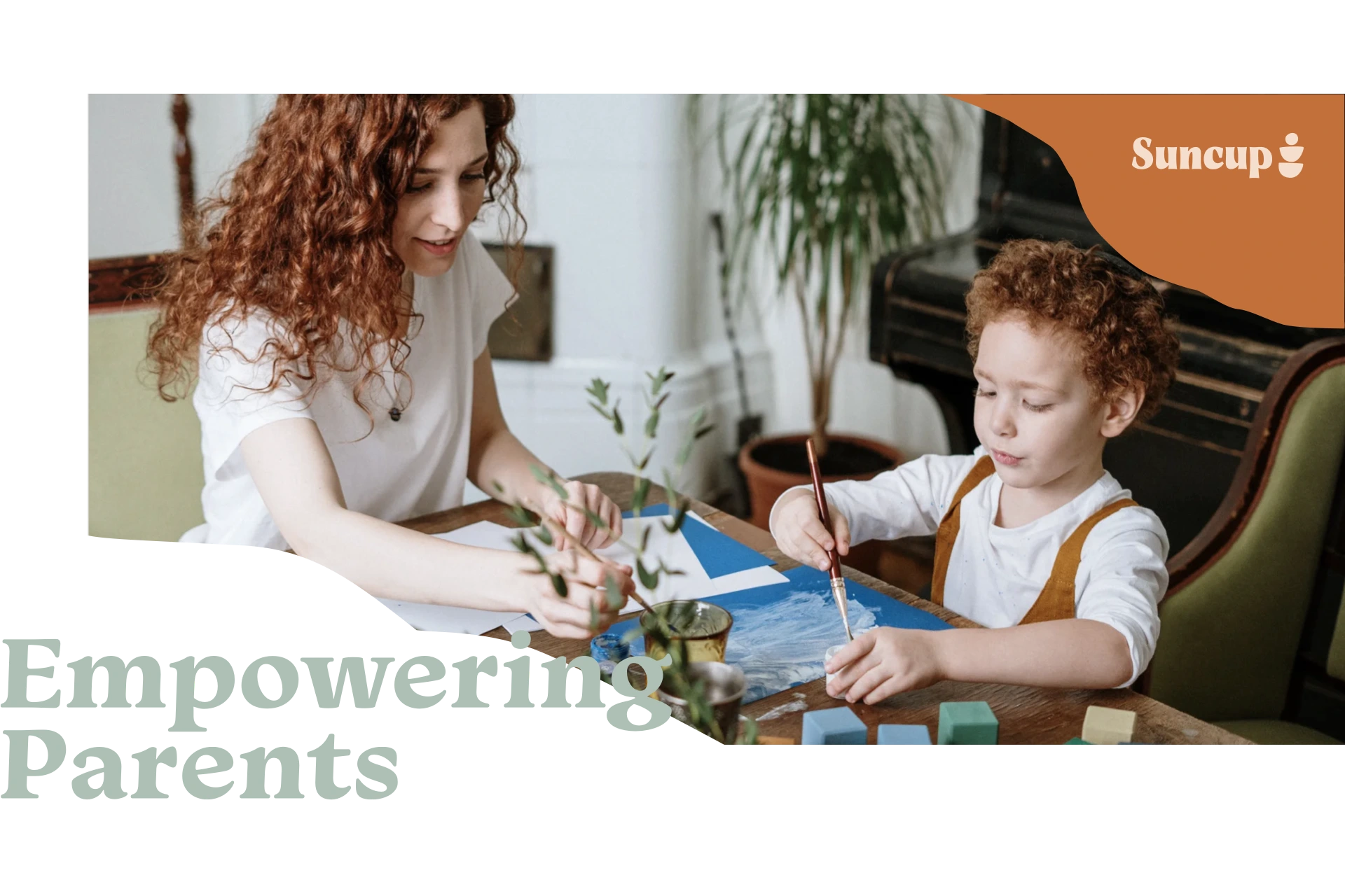
Suncup ABA is an applied behavior analysis therapy company that seeks to provide parents of autistic children the coaching tools necessary to help their kids thrive.
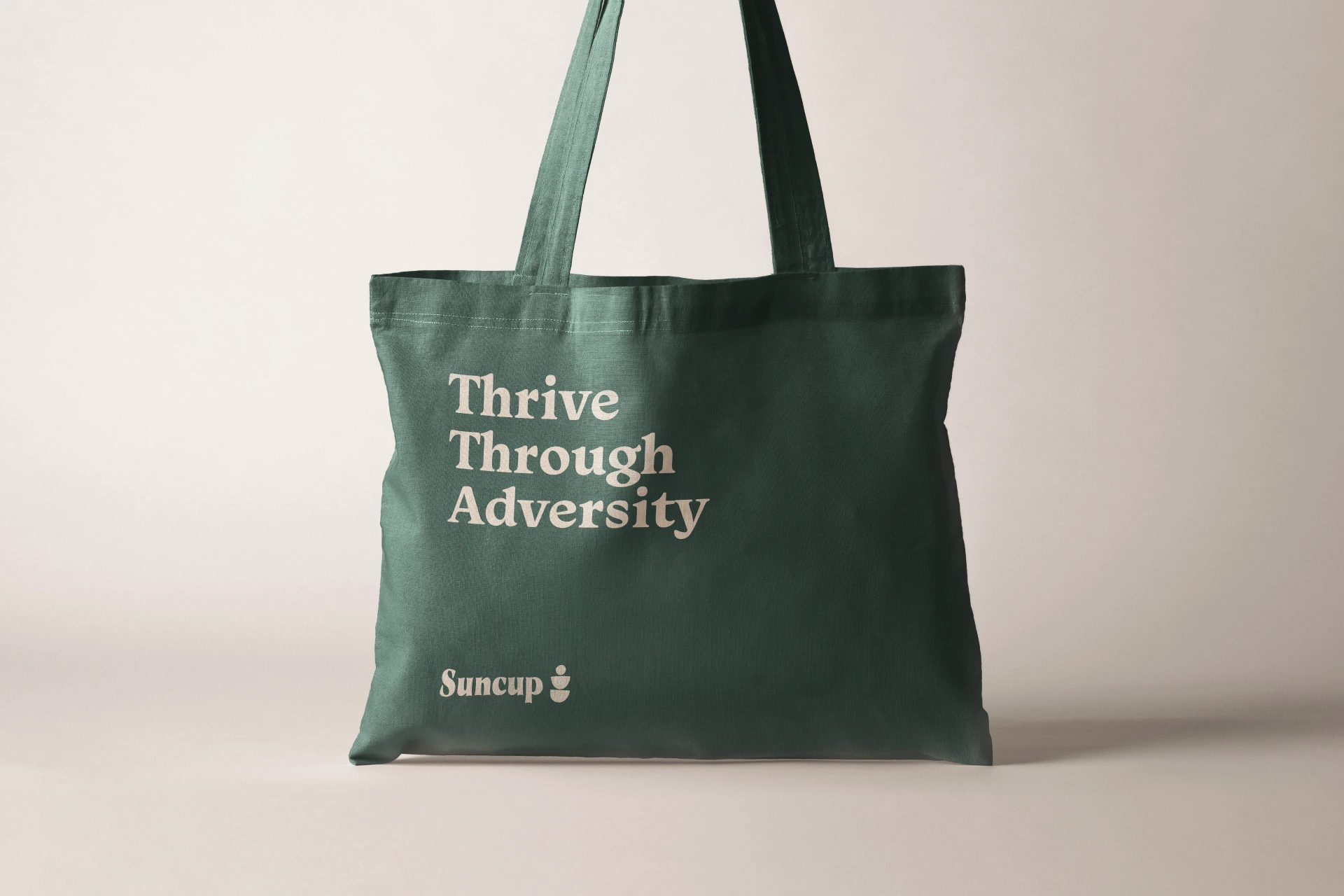
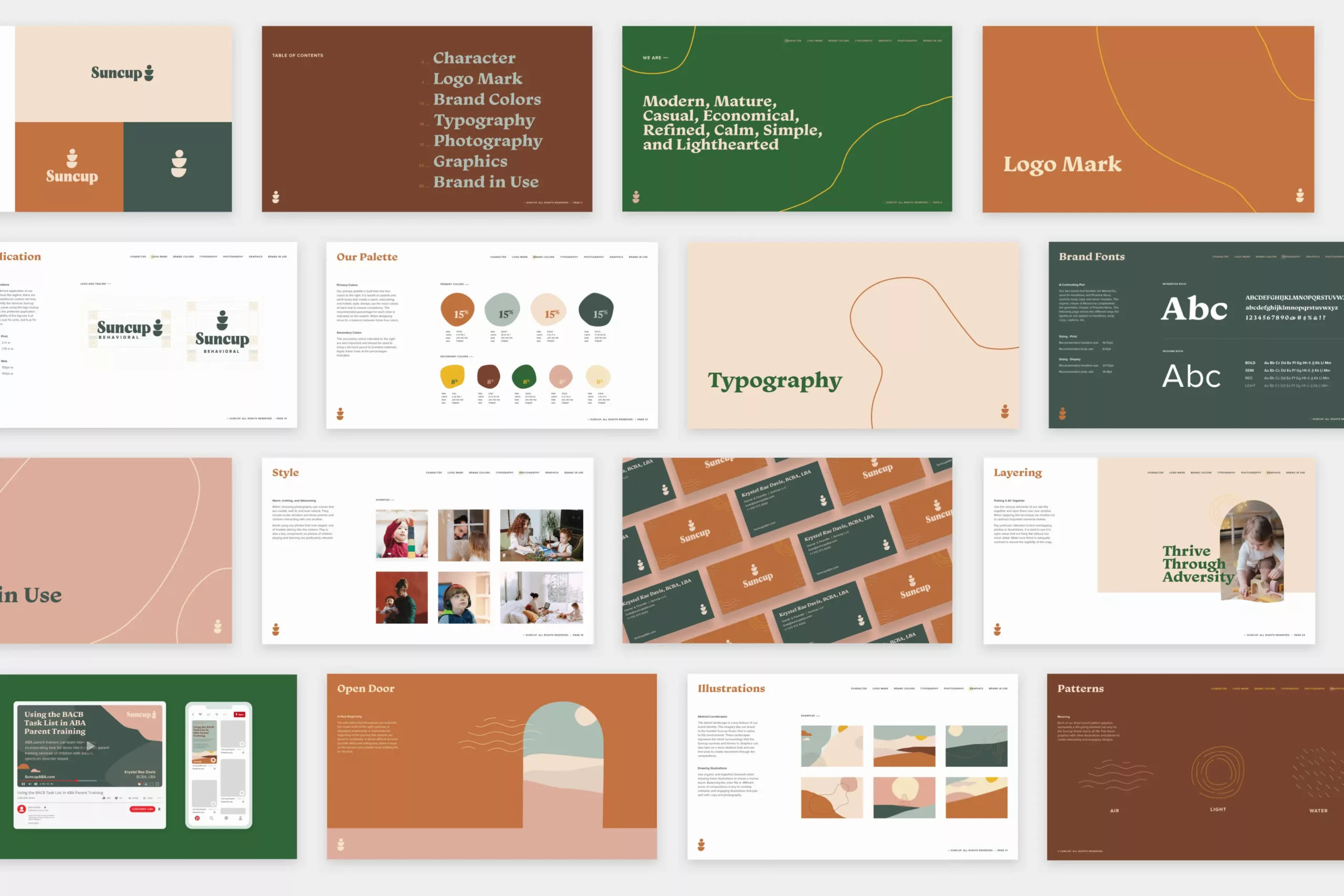
The brand identity we created is an ode to the mighty suncup, a humble little flower that lives in some of the most inhospitable deserts in the US. It goes unnoticed all year long, until a bit of rain comes its way, then almost miraculously, it blooms and thrives, overcoming its harsh surroundings.
We drew a direct parallel to this humble little plant when creating the brand identity
— the concept being that no matter how adverse your situation might be, there is always room to grow and thrive. Overcoming our trials and challenges makes us stronger and provides us with the opportunity to learn and flourish.
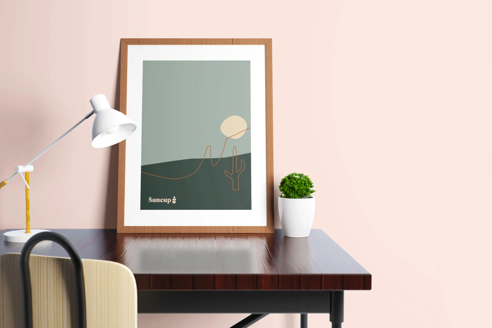
The imagery draws inspiration from warm colors and desert motifs that make up the suncup’s natural environment. Much of ABA therapy centers around the act of play. Many of the illustrations and graphics have a bit of abstract whimsy that draws similarities between the sometimes ambiguous and amorphous nature of therapy and the human mind.
