
Selenium Conf. Portland
Services Provided
Brand Strategy, Visual Identity System, Creative Direction, Logo Design, Promotional Media, Web Design & Development, Print Design
Selenium is an open source browser automation platform for testing web based software. The suite of tools is primarily used to cut out repetitive and tedious operations from developer workflows. Each year the Selenium community gathers at the Selenium Conference to celebrate the platform and share a year’s worth of innovations and new uses of the software. This year the event was held in Portland, Oregon and brought together over 500 developers and leading voices in the field.
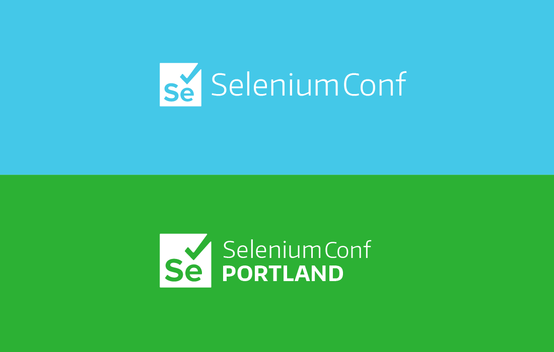
Logo Lockups
Brand Colors
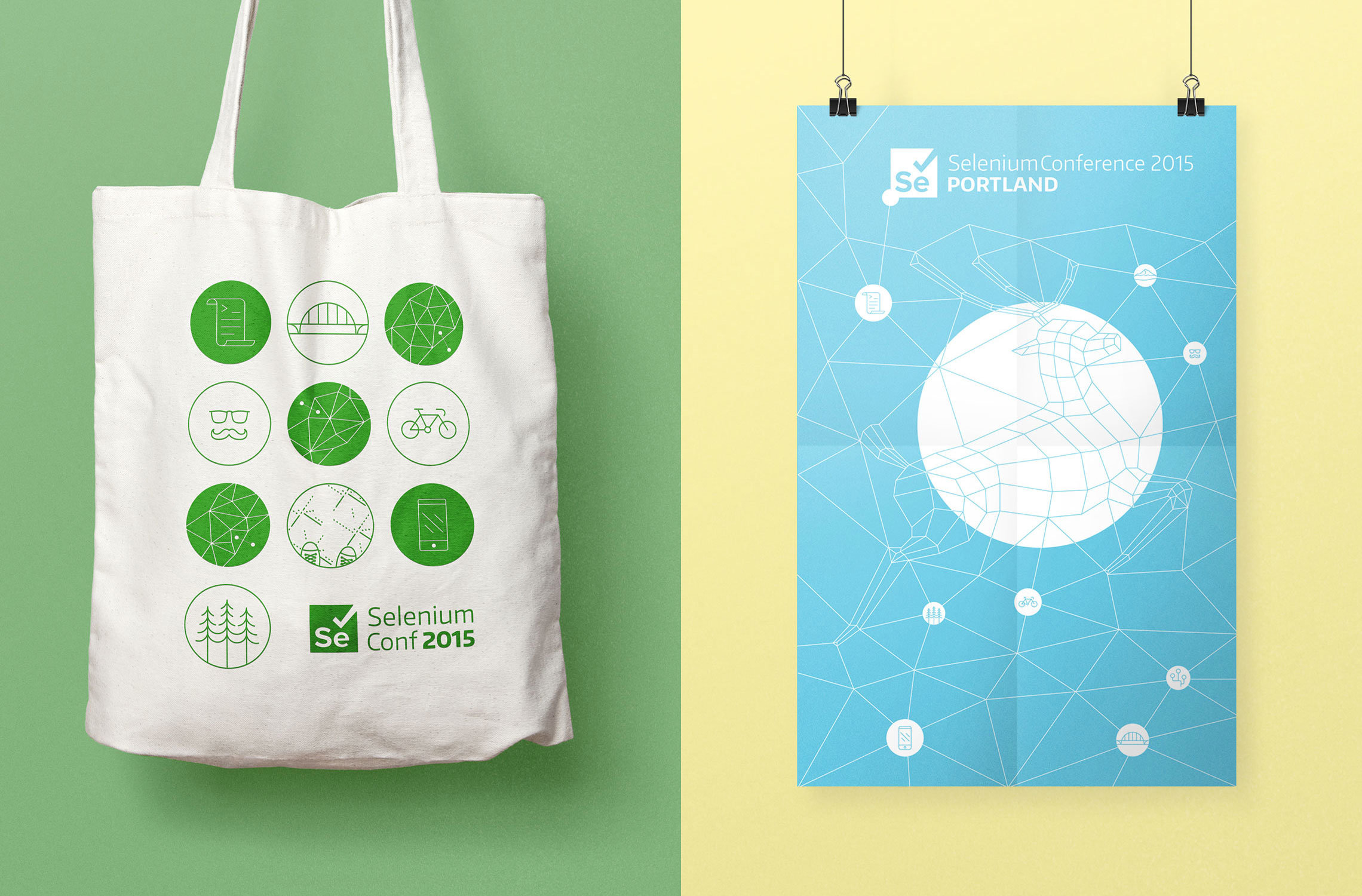
The goal of the project was to create a modern technology inspired, visual identity system that captures some local charms and quirks of the hosting city. The ubiquitously hated Portland airport carpet, the omnipresent hipster stache, and local delicatessen landmark that is Voodoo donuts, are some of the local themes featured across the various media created to promote the Conference and to foster a fun and memorable event for the devs attending.
Iconography
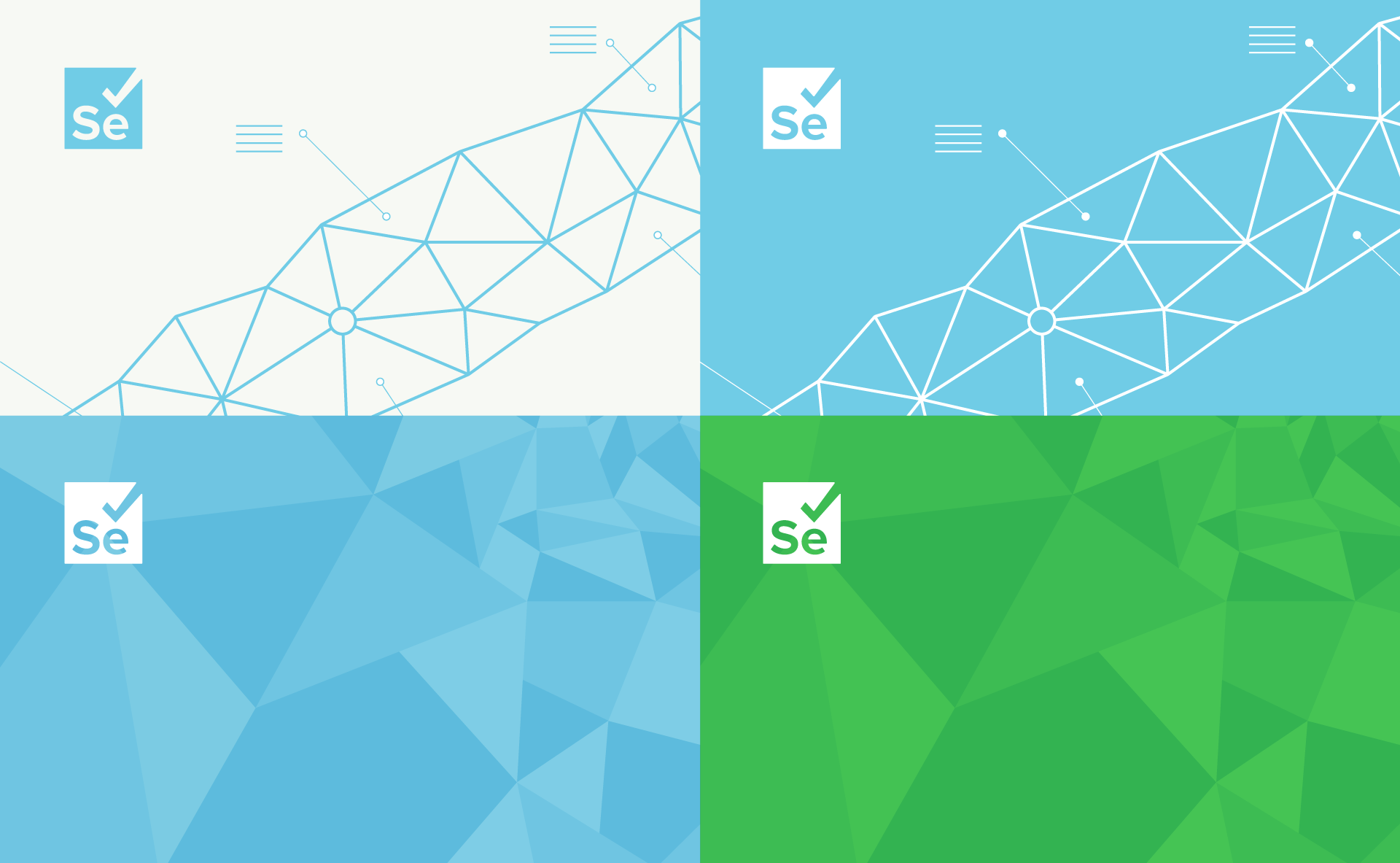
Since the main purpose of Selenium is to alleviate tedium and simplify dev operations, the identity is minimal and clean to communicate the ethos of the platform. The brand graphics allude to automation, computer processes, and the technological nature of the conference.
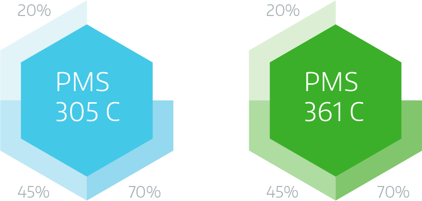
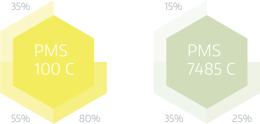
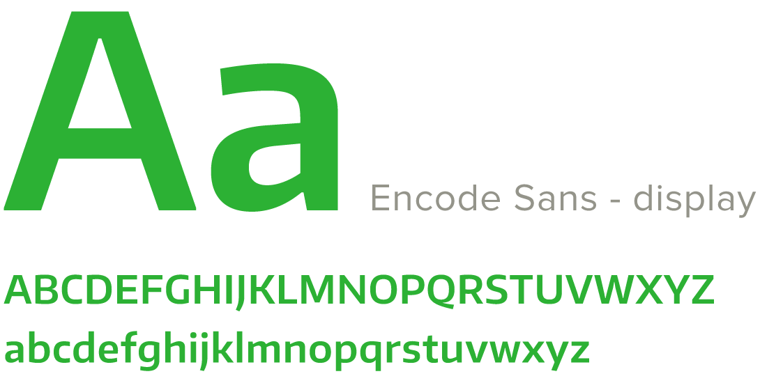
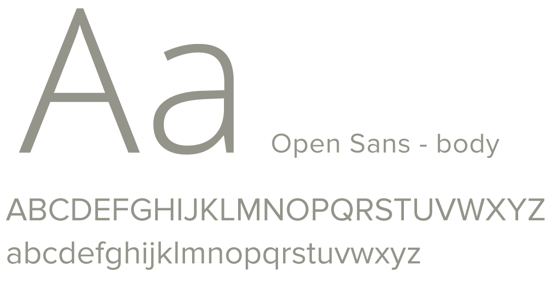
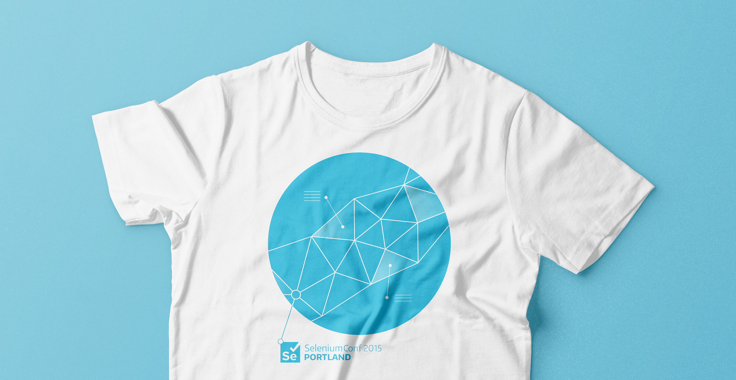
This same geometric style is used to illustrate the well known Portland stag and to further tie the visual identity to the location of the conference. A minimal approach was used when creating the visual language, from the iconography to the modern and legible fonts. The colors are fresh and upbeat and meant to embody the beauty of the surrounding nature of Portland.
Brand Fonts
Print Materials
The visual identity was applied to a host of media including tote bags, t-shirts, beer glasses, stickers, program guides, post cards, table tents, name badges, a plethora of signage, digital presentations, and a responsive website.
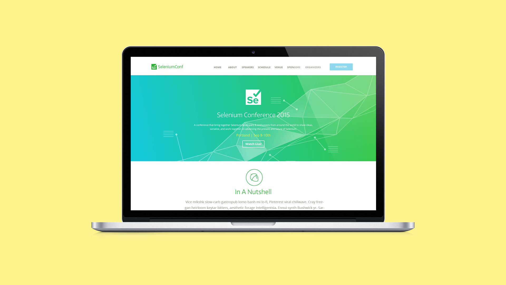
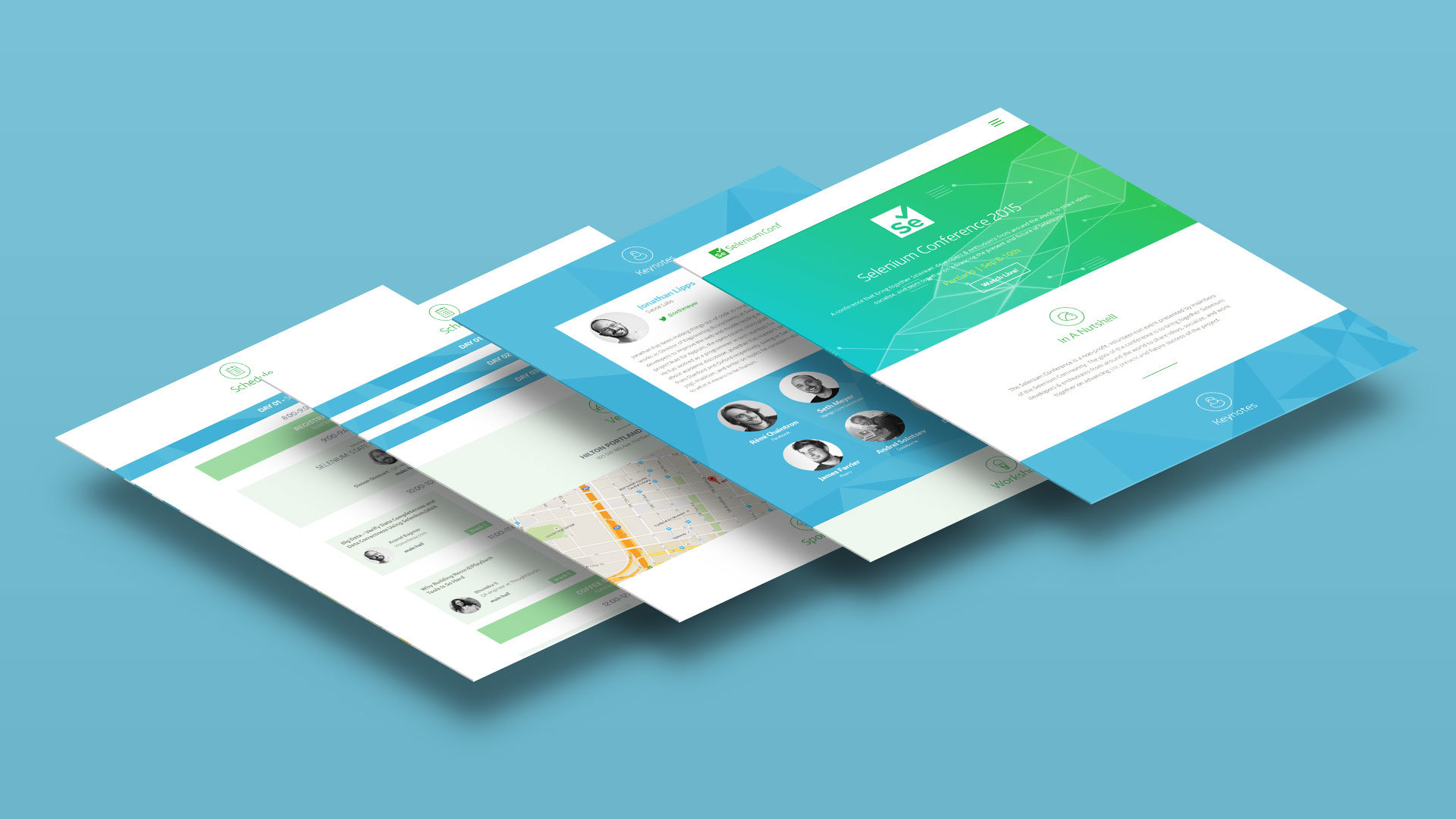
Responsive Website
The website was a particularly useful tool for attendees; it helped the users organize their days and read about the presenters and lectures. A custom collapsible calendar was developed with a mobile interface in mind, since most of the traffic during the conference is from cell phones and other mobile devices.
Team
creative & Art Direction: Petre Spassov
design: Andres Ruiz
animation: Charles Davis Jr.
development: Kovalent.co
Media Designed
tote bags, t-shirts, beer glasses, stickers, program guides, post cards, table tents, name badges, a plethora of signage, digital presentations, and a responsive website.