Lacuna Legal: Bridging a niche gap in the legal market.
Client: Lacuna Legal — Market: Legal Services

What we did
Logo Design
Brand Identity
Brand Collateral
Lettering
Team
Creative Direction:
Petre Spassov
Assignment
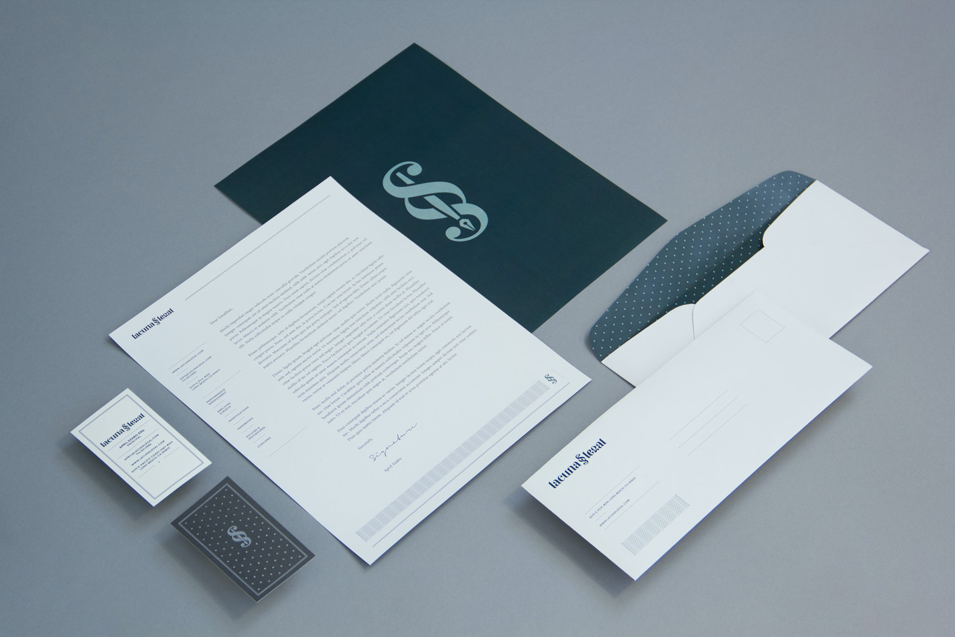
The Latin word “Lacuna” translates to “an unfilled space or interval; a gap.” Lacuna Legal bridges this gap in the legal market with its specific combination of services. The “section” glyph positioned between the two words represents their unique place in the industry.
Because of the conservative nature of the market, we set out to create a mark that stands out but remains understated and appropriate for the industry. The logotype was hand-drawn to create a unique character, then refined and vectorized for the final application. The letterforms draw inspiration from Didone typefaces to create a timeless look.
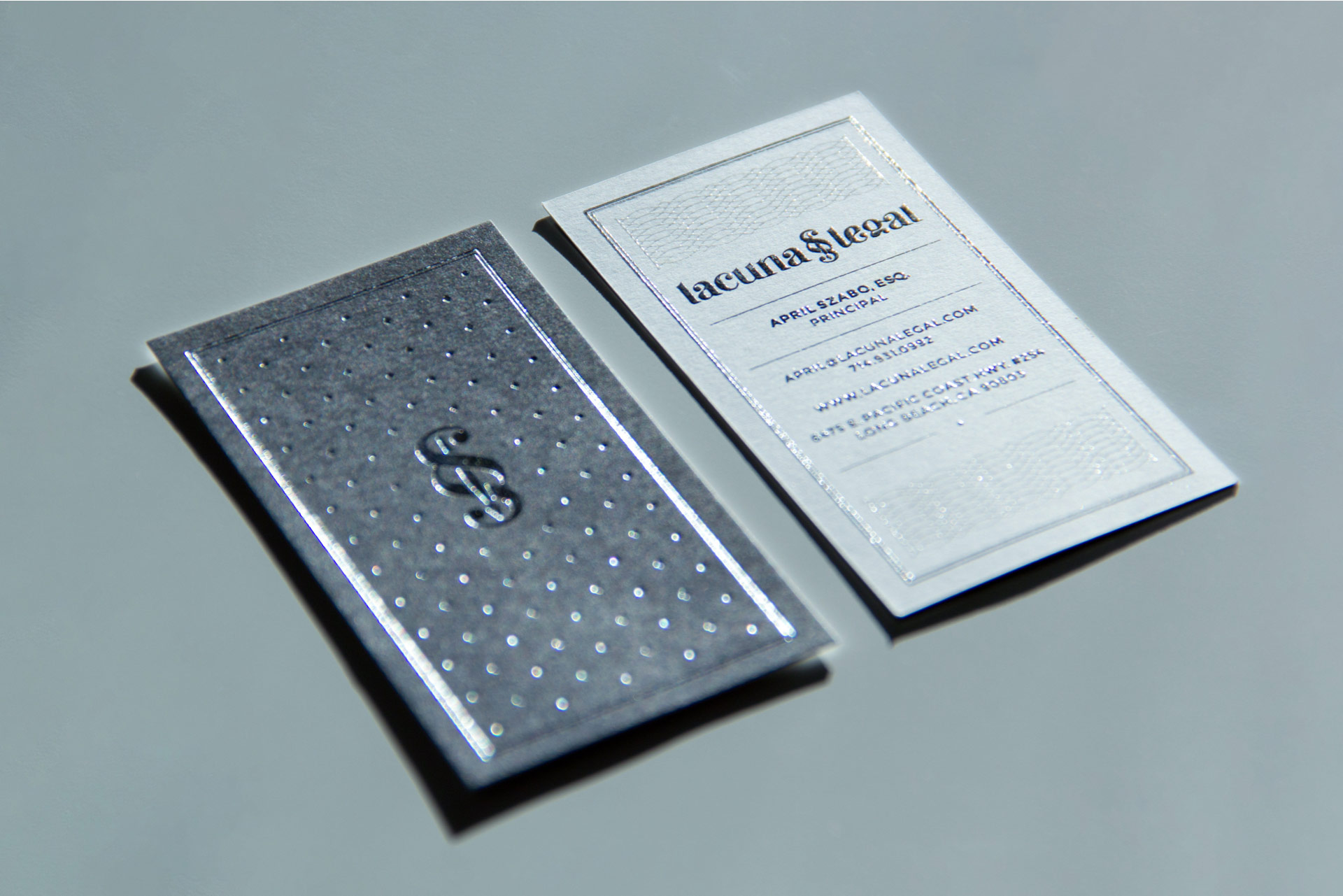
The identity was applied to letterhead, envelopes, business cards, and other business collateral. The cards feature both a silver foil stamp and thermographic ink on uncoated paper stock.


